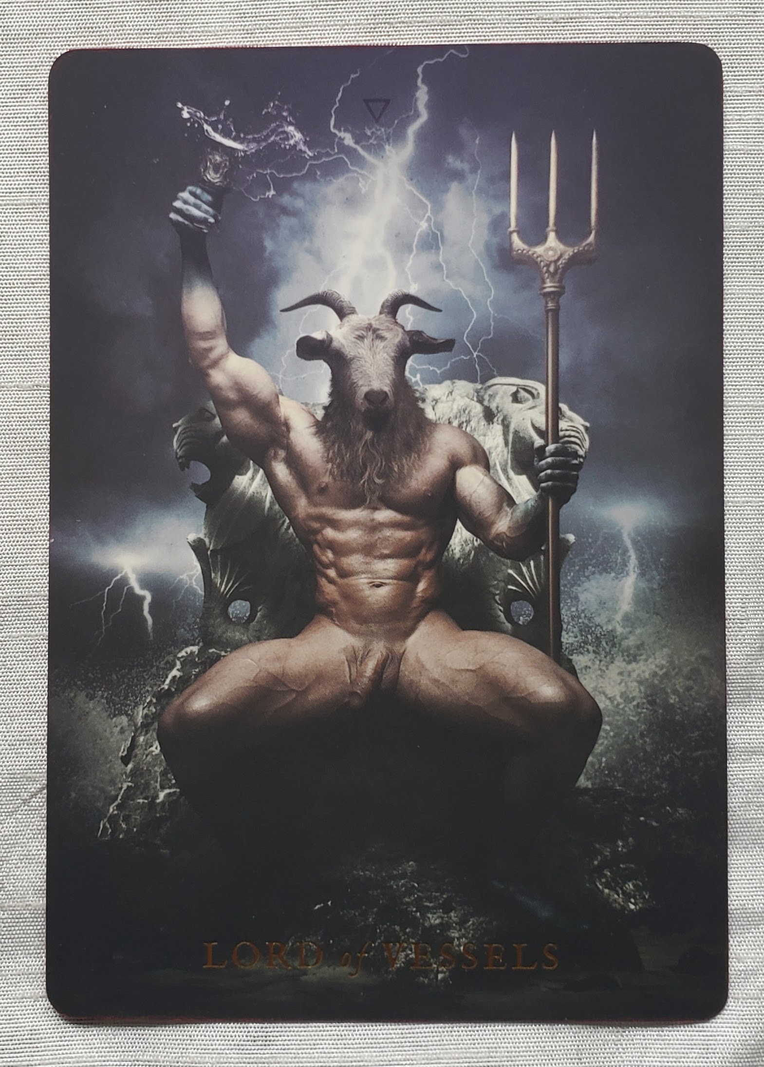
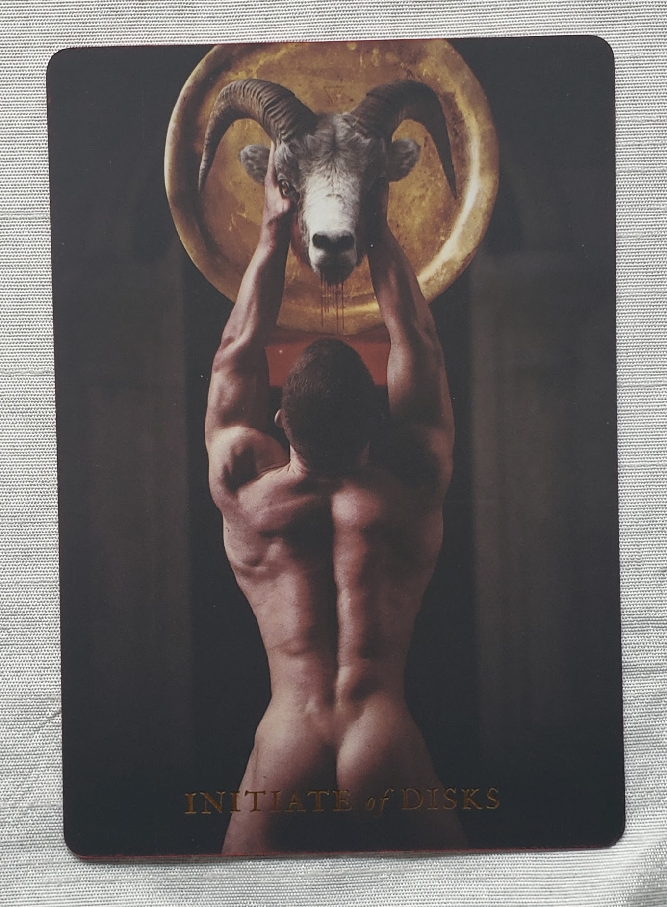
Months ago I first started seeing pictures of Allan Spiers’ The Sabbath Tarot pop up on Instagram accounts I follow. The masculinity and the play of light and dark in Spiers’ images intrigued me. I started following @thesabbathtarot on Instagram, and looked at Spiers’ The Sabbath Project website. I hesitated to purchase the deck because it was expensive for a deck I was not sure I would use, especially since I recently culled my collection of decks and gave away most of the ones I did not use when reading for clients. Yet the images drew me back again and again, and I read posts by folks who used the deck for readings. Ultimately, I realized this was probably a deck I could learn much from doing personal readings and intentional work, so I finally purchased it.

The deck arrived yesterday, packaged carefully to protect it, so there were no dents or creases. The deck comes in a very sturdy cardboard box designed to look like a wooden chest, which contains the deck, the accompanying book (The Sabbath Tarot Compendium written by Spiers’ husband, Jeff Cullen), and a bag for the deck. The symbol on the top of the box is also on the backs of the cards. As a result, the backs are not reversible. For me that is not a major issue, since I do not usually read reversals.
Whenever I look at a deck, I always check out the King of Cups (my Significator), the Devil (I’m a Capricorn), the Hierophant/High Priest, and the Page of Pentacles. These cards can make or break a deck for me. Spiers has included three versions of the Devil, which he also calls the Devil’s Arcana. They can be switched out, so that only one XV is in the deck, or you can leave all three cards in the deck for a reading. He provides some ideas about the ways multiple Devil cards can be read in this blog entry on The Sabbath Project website.
The Arcanas are designated Greater and Lesser with the suits of the Lesser Arcana named Blades, Disks, Staffs, and Vessels. The Court cards are the Initiate, the VVarden, the Lady, and the Lord. A quick note about the use of VV as W, which I’ve seen other folks comment about. The original Latin alphabet had only V, both U and W were later additions (as was J). W, initially written VV, was added in the Germanic languages as they developed. That is a simplified overview of a linguistic evolution. However, Spiers’ use of VV has historic and linguistic precedents. (Okay, that was not so short!) The other thing that jumped out at me while I played Solitaire with the deck (something I always do with a new deck to get to know it) is that the Ace of Staffs is marked with I while the other Aces are marked with A. I probably would not have noticed that difference for months had I not played Solitaire.
Spiers did rename some of the Greater Arcana cards to fit his concept of the deck. I did not find his renaming/revisioning jarring or bewildering, as I have in some other decks I’ve seen. In addition, all of the Greater Arcana cards are numbered, so it is easy to call to mind the equivalent in the familiar RWS Tarot.
- The Fool –> The Faun
- The Empress –> TheVVitch Queen
- The Emperor –> The VVitch King
- The Lovers –> Love
- Strength –> Lust
- The Hermit –> The VVanderer
- The Hanged Man –> The Marked Man
- Temperance –> Intemperance
- The Devil –> (1) Lucifer (2) Satan (3) Diabolus
- The Tower –> The Pyre
- Judgement –> The Demiurge

Spiers has a deep knowledge of the RWS cards, both Pamela Colman Smith’s illustrations and Aruthur Edward Waite’s system. Many of his illustrations are similar to, or easily bring to mind, the RWS cards, so folks steeped in the RWS deck and its descendants can quickly begin reading with this deck.

Here is an example where Spiers’ illustration differs vastly from Smith’s. In fact, his version of the Seven of Blades strongly reminds me of the Five of Wands. One of my Tarot teachers said, if you see something in a card that reminds you of another card, or if the whole card reminds you of a different card, go with it. It can be important in the reading.

One of the nice features of this deck is the inclusion of the correspondences placed at the top of cards. On the Greater Arcana cards (although not all of them) is the astrological sign associated with the card. The court cards have the element associated with the suit. On the pips are the planet, the element, and astrological sign assocated with each card. I do note that the triangles on the Air and Earth cards are missing the line through them.

The accompanying Compendium provides two pages for each card in the deck. On the left-hand page is a full-page picture of the card. The right-hand page has a list of keywords, a written description of what is in picture, and a fuller divinatory meaning. Spiers and Cullen use Invoked for the upright meanings and Banished for the reversed. The Compendium includes five spreads and two spells.
Finally (or firstly, since it is in his “Artist’s Note” in the Compendium), Spiers is clear about his intent to provide more depictions of men as witches. It was this masculine energy that attracted me to the deck in the first place. However, as masculine as the imagery and energy of this deck is, it is not devoid of the feminine. For anyone familiar with the RWS family of decks, the pips are where they will most notice the lack of female presence. Only the Ladies (the Queens) are there. The presence of fewer women is less obvious in the Greater Arcana, but still apparent. The one striking change is Death, which is depicted as a female figure.
I am looking forward to working with and learning from this deck.
The Sabbath Tarot card images (c) 2019, Allan Spiers
The Rider Tarot Deck card images (c) 1971, U.S. Games Systems, Inc.


Thank you so much for the review! I just want to clarify that some of the lines may not be visible due to the elemental symbols being so thin that they printed very faint. I just checked my deck and you can make them out if you look very closely.
As far as the I on the Ace of Staffs, that is intentionally done, one of the many hidden imagery and symbolism throughout the deck. A clue as to why this was done can be found in the Compendium. I look forward to you discovering more and connecting with the deck through its secrets! This was so awesome to read, and feel free to message me if you have any questions!
LikeLike
I did go back and look even more closely at the 8 of Disks, which I used for the example of the symbols. I also looked at the other cards in the Earth and Air suits. The lines are VERY faint, but they are there (aging eyes don’t help either!).
I wasn’t sure whether the marking on the Ace of Staffs was deleiberate or not, although I suspected it might be, which is why I just noted it without saying anything one way or the other. Thank you for the hint.
I really like this deck and look forward to working with it!
LikeLiked by 1 person
Dear Jeff
I would like to share with you and with your readers some of the research that I have done concerning the iconography of certain of the trump-cards of the “Tarot de Marseille”. As you may know, the iconographies of the trump-cards of the “Waite-Smith” tarot are derivatives of the iconographies of the trump-cards of the “Tarot de Marseille”.
In the following article, I demonstrate that the iconography of The Star could be explained in the context of the feast of the Epiphany: https://diaryofafortuneteller.wordpress.com/2019/05/15/the-star-on-the-iconography-of-the-seventeenth-trump-cards-of-the-tarot-de-marseille-patterns/
In the following article, I address the iconography of The Sun: https://diaryofafortuneteller.wordpress.com/2020/02/19/the-sun-concerning-the-iconography-and-the-titles-of-the-nineteenth-trump-cards-of-the-tarot-de-marseille-patterns/
In the following article, I address the iconography of The World: https://diaryofafortuneteller.wordpress.com/2020/03/02/the-world-concerning-the-iconography-of-the-twenty-first-trump-cards-of-the-tarot-de-marseille-patterns/
In the following article, I compare the iconography of Judgement to an illustration that appears in a Book of Hours: https://diaryofafortuneteller.wordpress.com/2020/04/03/representations-of-a-balding-male-figure-two-partially-comparable-illustrations-of-the-last-judgement/
I hope that you will enjoy the aforesaid content and that you and your readers will derive some benefit therefrom.
Regards
Kevin J W Mellors
LikeLike
Thank you for sharing these, Kevin.
The figures you refer to as “a balding male figure” in the Last Judgement and the Pope cards might have tonsures rather than being balding.
LikeLiked by 1 person
I am very grateful for your response, Jeff, because I had not been introduced to the term “tonsure” prior. Would you object to me adding a note to the relevant article in which I acknowledge you by name for having introduced me to the said term? If I may, I would also like to include the name of the present blog.
LikeLike
Not at all, Kevin. Always glad to add to the discussion.
LikeLike
Please excuse my tardiness, Jeff. I have updated the relevant article.
LikeLike